Introduction
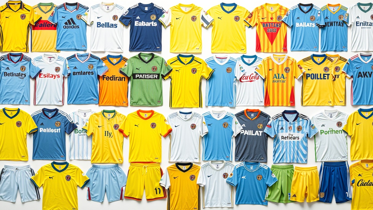
As the new year rolls in, soccer enthusiasts in America witness an impressive array of fresh kits unveiled by Major League Soccer (MLS) teams in January and February, soon followed by their National Women’s Soccer League (NWSL) counterparts. While top-tier teams may garner the most attention, the true creativity of American soccer’s kit culture often flourishes in the lower divisions. Whether it’s the USL Championship, USL Super League, or NPSL, these leagues often break away from restrictive league agreements, allowing for distinctive and bold designs that reflect local flair.
Highlighting Unique Kits
For example, Carolina Core FC, an independent team in MLS Next Pro, has made a strong statement with their home kit, showcasing a design that pays homage to the region’s textile industry. The gradient of bold colors fading gracefully upward creates a striking visual without overwhelming the senses. Accents of gold in the kit and its emblem are a nod to the club’s identity, making it one of the standout kits in American soccer.
In a city known for its extravagance, Las Vegas Lights FC’s “Downtown Gold” kit perfectly captures the spirit of its surroundings. Featuring shiny trims and varying shades of blue alongside gold details, this kit embodies the essence of vintage Vegas with its vibrant, over-the-top aesthetic.
Contrastingly, Miami FC opts for a minimalist take with their away kit, inspired by the city’s flag. The kit incorporates orange accents and subtle embossing that signifies the city’s founding year, embodying a clean design that speaks volumes despite its simplicity. In a realm where pink-and-black kits adorned with star players dominate, this understated design remains a refreshing choice.
Oakland Roots SC has consistently produced visually striking kits since their inception, and this year is no exception. Their home kit features colorful patterns reminiscent of stained glass, drawing inspiration from the club’s logo. The design is both beautiful and representative of the Roots’ identity, though their away kit pays tribute to the city’s MLB team with a classic green and gold homage.
Moving onto the newer club Portland Hearts of Pine, their kits are setting a high bar. While the home kit stands out for its artistic design, the away version truly shines with a heart motif inspired by local lore. Celebrating Portland’s unique tradition with the Valentine Bandit and transforming that into visual art, this jersey is both meaningful and visually compelling.
Noteworthy Mentions and Critiques
On a less favorable note, Chattanooga’s away kit suffers from an ill-conceived design that fails to unify its elements, leading to a chaotic look.
Meanwhile, El Paso Locomotive FC’s third kit, named the “Graffiti kit,” seeks to connect with local culture but instead falls short artistically.
Indy Eleven’s reliance on a checkered-pattern has not always produced positive results; this year’s away kit features a disjointed design that detracts from its overall aesthetic. Sacramento Republic FC’s home kit, though typically successful, falters with overly complex hoop patterns that clash, leaving an odd impression.
Spokane Velocity FC has remained consistent in its visual identity, but its recent stripe designs have received mixed reviews, particularly their away kit that appears washed out.
Carolina Ascent FC, in its USL Super League debut, showcases an ambitious technicolor kit that mirrors the breathtaking sunrises over the Carolina hills. This design cleverly incorporates colors from the team’s crest, boldly affirming their identity.
Forward Madison FC pushes the creative envelope further with their vibrant “Icebreaker” kit, using pink and blue tones that evoke a sense of fun and audacity, reflecting the cooler climate where they play.
With a nod to the influences of local culture, New Mexico United’s kits highlight bold graphics inspired by Meow Wolf, adding an artistic flair to their jerseys.
Lastly, the New Orleans Jesters don Mardi Gras colors for a kit that embodies whimsy and fun, quintessentially capturing the spirit of both their city and team. Meanwhile, Tampa Bay Rowdies assert their long-standing identity with a striking green and yellow combo that proudly represents their rich history in American soccer, unapologetically vibrant and true to their roots.